Designing a Seamless End-to-End Travel Customer Journey
Website, newsletter and first-contact redesign for a boutique German travel agency — from five separate touchpoints to one connected system.

A boutique agency, redesigned as one system
Every trip was assembled by hand — a designer briefing a partner agency abroad and negotiating the itinerary over weeks of email.
Joining as the agency's first designer, I researched the full funnel through staff interviews and a review of existing materials, then redesigned the website, newsletters and internal tools as one connected system. The website is now live and the work is ongoing.
| Research | Staff interviews, workflow audits, systems mapping |
| UX strategy | Journey mapping, service blueprinting, funnel diagnosis |
| Design | Full website redesign (live), preference-capture tool |
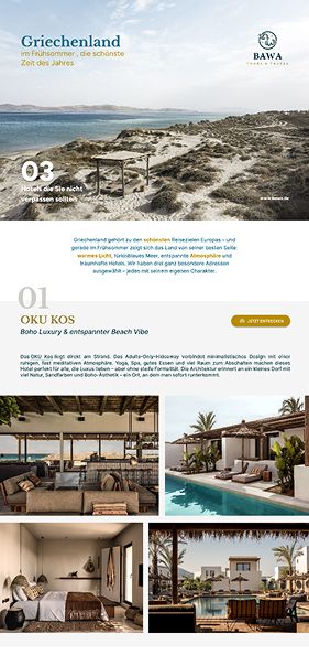
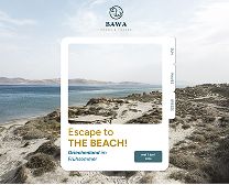
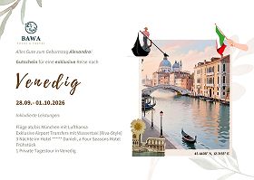
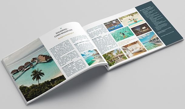
| Brand & comms | Newsletter, brochures, typography, collateral |
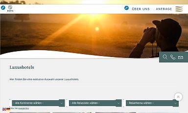
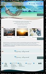
Finding the problem before naming it
Interviews, a workflow audit, and a review of what the service actually produces — clustered into five recurring themes.
Every role, not just the loudest
Travel designers, back-office, leadership — open-coded and clustered into five themes.
Following one request end to end
What actually happened at each handoff, not what the process document said.
Reading the outputs backwards
Website, newsletter, offers, confirmations — what a service produces shows where it improvises.
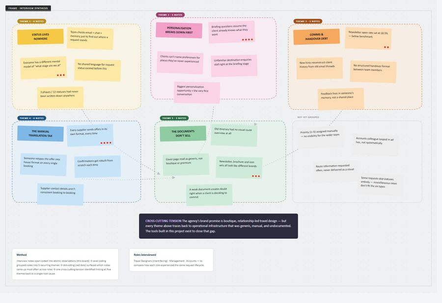
Mapping the service, twice
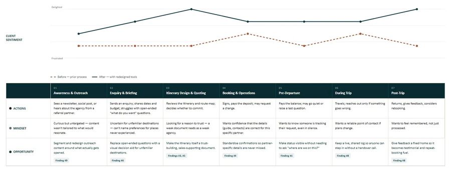
A journey map for what the client experienced, a service blueprint for how the team delivered it — aligned so every pain point traces back to a research finding.
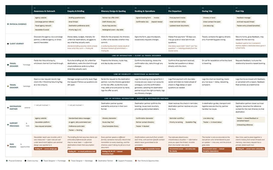
A manual translation gap
Five themes came out of the research. Underneath all five was the same thing: work being translated by hand between formats.
| Stage | Before | After |
|---|---|---|
| Awareness | Website hadn't been revisited in years | Full redesign, now live |
| Pre-booking | Briefing assumed clients knew what they wanted | Japan Travel Cards, a visual preference tool |
| During booking | Status tracked through inboxes and memory | Slack-scanned status tracker + route-map generator |
| After booking | Confirmations rebuilt for each partner | Confirmation generator with partner contacts + calendar sync |
| Feedback | 18.5% newsletter open rate, informal handoff | Redesigned newsletter (+51%) and a self-serve audit trail |
Create a single shared system that closes the manual translation gap between DMC partners and travel designers — so status, offers and confirmations move without anyone retyping them by hand — while still supporting the agency's approach to personalisation?
Five interventions, one system
One at each point in the journey, from first visit to signed confirmation.
Website Redesign
Closes the top-of-funnel gap before a client reaches the booking conversation.
Japan Travel Cards
A ~7-minute visual preference tool, completed before the itinerary is built.
Itinerary Generator
A house template plus an in-browser route map, embedded into the document.
Status Tracker
An AI agent reads Slack each morning and updates a shared tracker.
Confirmation Generator
Invoice in, client-ready confirmation out, partner contacts attached.
The website, redesigned
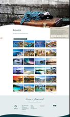
Reorganised thematically — a storyline rather than a list of static pages — with a colour, type and component system spanning all five pages.
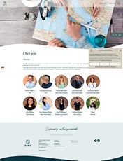
- About page: staff directory → trust-building step before the enquiry form
- Hidden nav sections surfaced — no extra click
- Navigation switches from transparent to solid on scroll
- Destinations grouped by region, with a clickable map
From wireframes to live site
Every page was wireframed first — structure and hierarchy settled before a single colour or photograph was chosen. Drag the handle to reveal what shipped.


The site in motion
A walkthrough of the live site — scroll behaviour, navigation states and the transitions that don't survive a screenshot.
Design system — quiet luxury
Japan Travel Cards
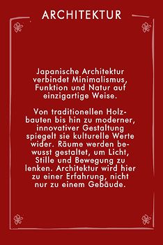
Sent as a presentation during initial conversations — a visual vocabulary replacing an open question, completed in ~7 minutes before the itinerary is written.


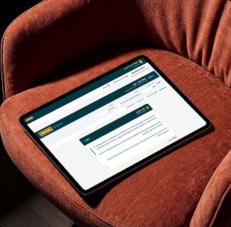
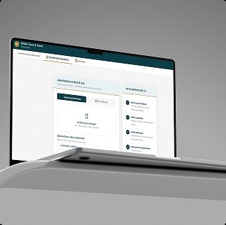
The document generators
Two documents rebuilt by hand on every booking — now generated from one shared information architecture.
Slack Status Tracker
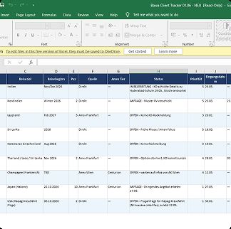
A shared language, co-designed with the team — not a tool first. Standardised messages let an agent scan Slack each morning and update a tracker automatically.
The agent reads only the uppercase word — machine-readable, without making anyone write like a machine.
- One place to see every active request, at a glance
- Urgent work prioritised automatically
- A shared language across the team for status
- New joiners onboard without a full handover
- An audit trail on every request
Brand & communications
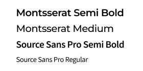
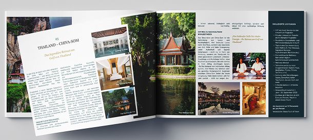
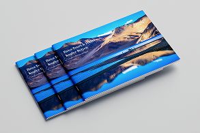
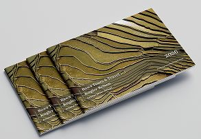
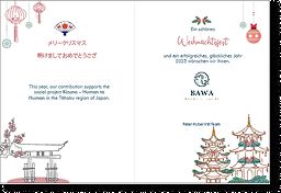
Newsletters, brochures, vouchers, seasonal cards, a locked type system — the connective tissue tying the other four interventions together.

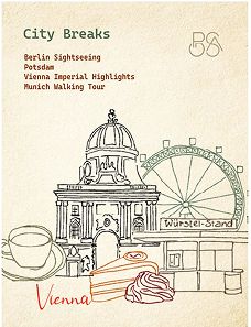
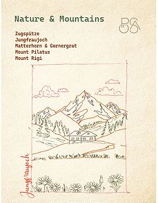
What changed
Website via GA4 before/after launch; newsletter via platform analytics; time saved is a team-reported estimate, not a timed study.
The website, in detail
Beyond the numbers
- The status tracker is still in daily use — the hardest bar an internal tool has to clear
- New joiners onboard without a verbal handover
- Sentiment shifted most at Itinerary Design & Quoting
- The site is live; engagement is still climbing
Where this could still grow
- Instrument the cards — completion rate, and how it affects conversion
- Extend the card system beyond Japan to the next few destinations
- Move the tracker from a spreadsheet to a queryable source of truth
- Feed post-trip feedback back into the card set
Check out other projects
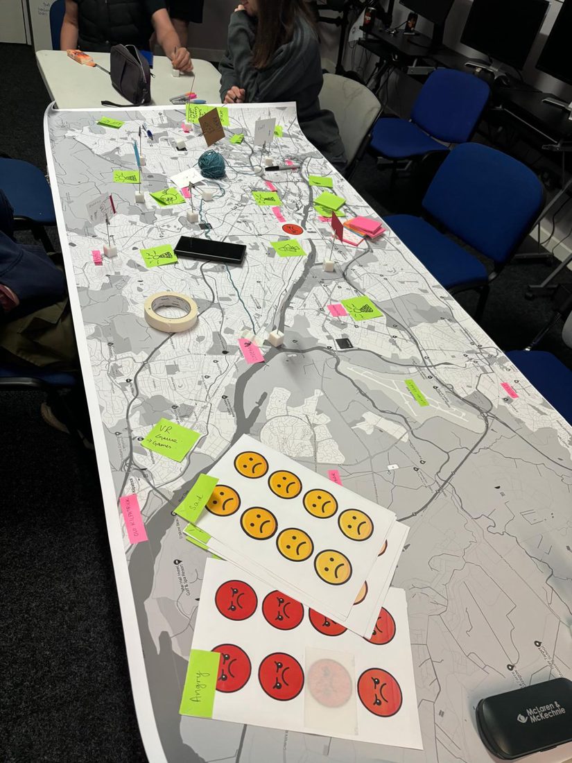 Social Innovation & Service DesignReimagining Travel for Autistic AdultsCo-design workshops proposing inclusive public transport, pitched to Glasgow City Council.Brand & Visual StorytellingVisual StorytellingLogo, packaging and visual identity work across Pepper & Kaapi Co. and Ekorro.
 PlaygroundMiscellaneous WorkSummer school, vibe-coded tools, art therapy and a self-initiated donation drive.
Download CV →